Categories are dead
In the attempt to understand the chaotic world we live in, we rely upon categories. We live in a city or in the suburbs, we go to school or we go to work, we are male or female, married or single etc. In the design field user experience (UX) we often apply categories to users. Some use personas, stereotypes, archetypes, or other types of categories. But designing for users in today’s world requires us to kill the concept of categories and start learning how our user behave.
The search/index company Fast said many years ago that we should stop tagging our documents. Just write and we will categorise and index your text for you. How well did that go? I am curious to know how they managed to catch the author’s intention. The book “Everything is miscellaneous” by David Weinberger deals with the fact that categories or classification can be wrong and sometimes dangerous. Both automatic or manual categories can have great value to us, but they can also be erroneous to a dangerous degree, or just plain unhelpful.
The most famous categorisation is perhaps the Dewey decimal system from 1876. It has served as a great help for thousands of librarians all over the world. Although it has been updated over 30 times until recent times, an increasingly large number of books are not categorised in the system. Not only because there are now new books that don’t fit into the categories but also due to how books are published and distributed today. Even the equally old periodic table in chemistry has its weaknesses, but perhaps holding up stronger than Dewey.

In more mundane matters, earlier you were either unmarried, engaged to be married, married, or widowed. Later this changed to engaged, married, separated, divorced, on a break, single or widowed, we add categories to describe more accurately what we are dealing with. Now, we can be married but not living together — or living together and not being married, we can be married to a tree or a dog or married to several people. Not sure if I have heard about a woman being married to several men yet, but that’s waiting just around the corner, I guess.
Peter is 37 years old, married and has two children…
In design, it is common to use personas which is a way to categorising users. We divide our users into prioritised representatives of a larger group of people. These groups or personas share common features that is meant to aid us in the process of designing an interface, system, or a service.
The categories we use earlier apparently had a meaning to them. If you were married, then you lived together, if you were a student, you physically attended a school of some sort. This is not the case anymore — if it ever was. The statement in a persona like “Peter is 37 years old, married and has two children”, isn’t that obvious as to what it implies or could help us. It could mean that Peter is living with a woman, they were married in a church and together they have two children. It could also mean that Peter is legally married to Tom in a non-religious way, and one child is from a previous relationship Tom had, and the other child is adopted by Peter and Tom — or brought forward by a woman sharing their lives.
Having this statement in a persona doesn’t really help me as a designer to neither empathise nor give clue to how that affects Peter’s ability to operate a user interface or giving him the experience we have set as a goal.
How about a student then? Would that help as a persona or category that we can design for. Well, what type of studies does he take, is he a junior student, senior, returning student after having worked for 25 years? How far has he come in his student life, before he starts the studies, first year, last year, just after his exams?
Not long ago, people were either male or female. Today, we have an increasingly number of genders you can identify as or being addressed as. The category itself has variations. You can identify as a one gender but would like to be addressed as another. Does it even matter if Peter is a man, transgender or a gender nonconforming? When it comes to using a system or a service there can be issues that will affect it yes, but mostly is has nothing to do with the matter. Being a man doesn’t mean that you behave in a certain way.
The personas or categorisation can help you in a marketing perspective where you are more interested in the group than the individual, but even here they constantly tread wrong. In insurance they used to say that in a family the women made the decision to buy the insurance, but the man paid for it. Today this mindset can be catastrophic for you if you administer an insurance company. Marketing personas has wrongly been used for design purposes in many projects. The people buying your software and the people using you software may be very different people.
What helps then?
It helps to do a service safari and observe how people are using your interface, how they are consuming your service or how they are functioning in the space we are trying to improve by design. We need to be there, and we need to observe and talk to people long enough so that we have seen a fair amount of user behaviour. We can’t observe everything but that is where the designer comes in to see how we can deduce a draft for a solution (or several) from the observed facts.

And even after acting as clever designers we can’t be sure to have learned enough. We can make a system for students, test it, release it, only to learn that students need different information and interaction depending on where they are in their life cycle as a student. And even students on the same program, of the same age, same level, same academic background can have very different aspirations. Or they can have different abilities in terms of physical or mental health that affects how they make use of a system or a service.
Long live design
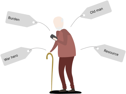
We usually don’t know enough about our users to put them in any category that can help us. Categorisation is a mechanism that our brain uses to deal with chaos and complexity in the real world. We make bad decisions here too, but the brain is trying to help. Who hasn’t talked to a person over 80 and raised his voice and spoken slower and louder? Our brain does this for us, thank you brain for so many embarrassing episodes.
Design is another way of making the complex understandable, and design requires that the brain is thinking in system II — not system I (“Thinking, Fast and Slow”, Daniel Kahneman). System I is the lazy brain that assumes and makes decisions fast and protects us, while system II is where our analytical abilities are set in operations. Categories are dead, long live design.
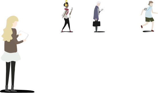
 I meant to use this illustration as an example of a good use of personas; in a humorous way as many designers have made cut out cardboard versions of their personas to increase empathy.
Then I recalled a topic in the book “Blink” by Malcolm Gladwell where he addresses subconscious decision-making. A police incident gone horrible wrong by making a fatal decision of firing the gun at an unarmed person based on too little information and assumptions. Putting a young man in the wrong category — and then acting on it.
Just to be clear — I respectfully know that many of my colleagues have made many great systems using personas but I also believe that their design work has not been build that much on the personas themselves but more on their gained knowledge of working to identify the personas.
Agile ability
We as designers and developers of great systems need to do more research — especially in agile projects where research has been undermined for so many years. Unsure of how to include research into agile projects? Ask me, I’ll be happy to show you.
Agile methodology is by design made to be helpful in projects where you don’t have all the answers. Research should be the core of agile projects, not an afterthought. And certainly not dismissed as a waste of time.
Agile methodology is also about iterations. The chances that you are getting it right the first time is minimal. You’re just not that good, nobody is. The clever thing to do is to make an honest first attempt and then test, release, and get feedback from the usage. Then do it all again. More research, more designing, more development, more testing, and learning. This is the agile way.

I’m just saying, don’t rely on categories made by yourself or anybody else when designing, learn about your users through constant observations and interviewing.
I expect some of you to disagree with me, I respect that, let’s have a talk over a cup of coffee.


