-png.png)
How can designers support the Developer Experience? Read more about the term, tools to try and tips on how to enhance it in your team.
So, what’s Developer Experience?
Developers are users of what you deliver as designs, and they deserve a great user experience, what we call a Developer Experience (DX). The developers in your team are also users of what you deliver as a designer, so it is basically all about the user experience for developers. DX is usually comprised of four main components: support for automation, fitting architecture, supporting a good process and culture, and using tools that give superpowers.
The automation will help the developer get a jump start when for example deploying a website, or automate collecting base styles for a new app or website from Figma with a plugin from the Figma community. Why do it manually on each project when the task could be a candidate for automation?
The architecture should support an easy setup and how to maintain the system with for example video tutorials, a good CLI guide, documentation, or a well-documented guide to fit the developers' needs. I’m sure you have seen unnecessary complex guides or maybe outdated documentation for a setup.
Process and culture is a key component to support a good DX. The system should have detailed documentation and at the same time a structure that can be used to get a quick overview when needed. For example, when the developer accidentally performs an action that leads to an error, the system should be able to help the developer easily recover from that error. Furthermore, the process should support a culture where failure and learning from it can openly be discussed in the team.
Using great tools to support the developer in workflows such as QA, deployment and feedback will give the developer superpowers to fit the team discipline, and in the end, helping developers writing good and SOLID code.-png.png)
Designers should embrace DX
Speaking as a designer who also works with front-end development to the nitty-gritty, a good process between designer and developer is key in creating a valuable collaboration and reduce misunderstandings.
When designing in Figma, there is plenty of details of a prototype such as colours, typography, grid design, transitions, several states of the app, and several (sometimes complex) components.
It’s a lot to think of, and sometimes details are forgotten or the designer might think that some details are obvious that others understand. That might cause an information gap in the process as the developer might have a different interpretation of the concept of the design or component.
Usability is about people and how they understand and use things, not about technology (Steven Krug, Don’t make me think).
As Steven Krug states in his book Don’t make me think, he stresses the importance that it doesn’t matter how great technology your team uses, it’s about the processes and communication between each team member that matters. We need to have that in mind while looking into tools to be used in the team. Also, you should always be on the lookout for new tools that can aid in the automation of repetitive tasks, for example setting up a new component library such as Storybook.
How to communicate interactions
Some tools can help explain how interactions and micro interactions should be. It can be via Figma, Adobe X, Sketch or other prototyping tools. Right now we’ve tested a new tool called Framer, and it focuses on interactions and animations to your designs. If using a new tool is too much, maybe you could consider using simple but powerful gif-animations with for example Gifox.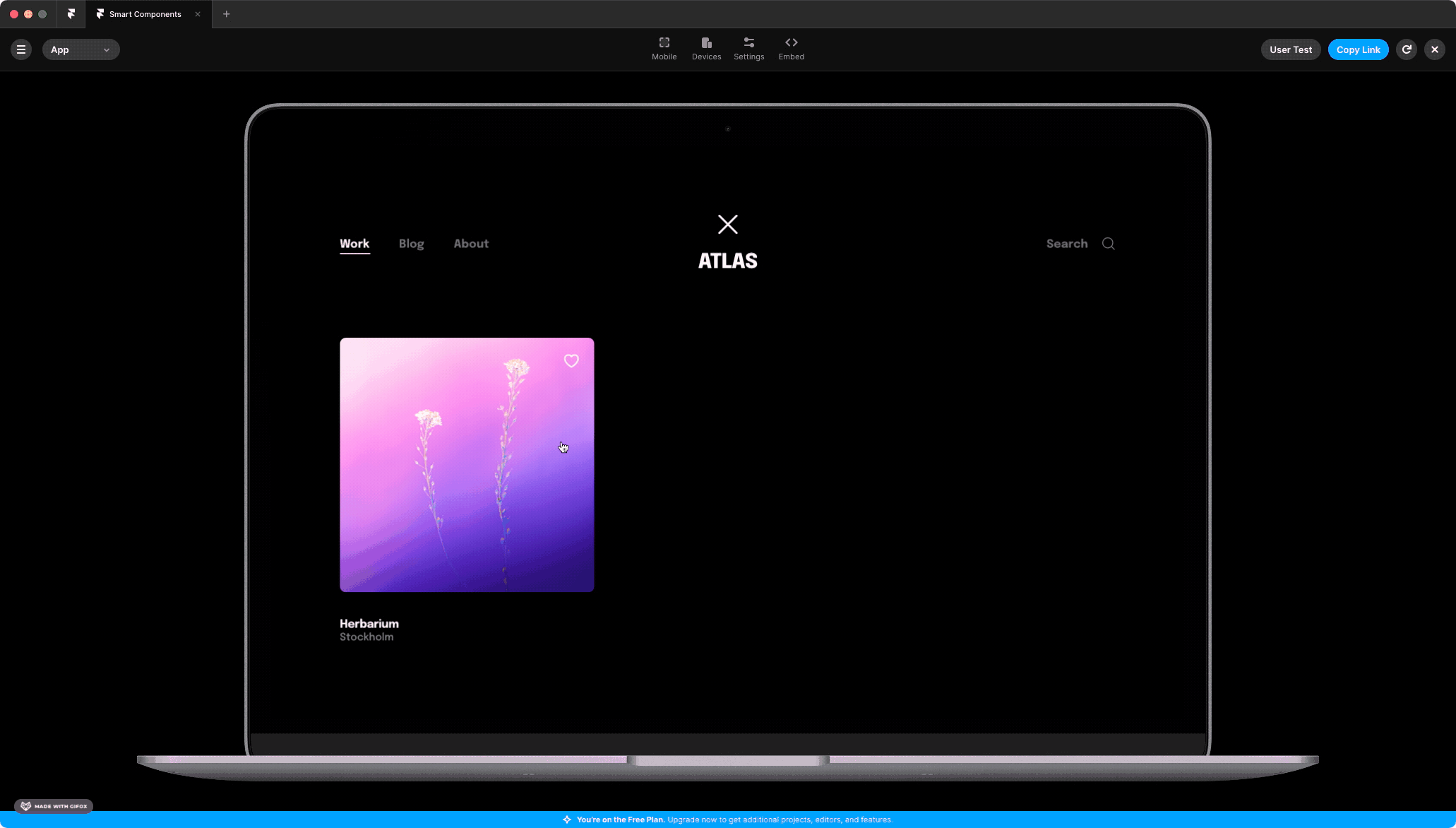
This prototyping tool is much like similar tools, but it highlights the advantage of communicating interactions and animations on elements in your design. The tool supports easy access to Figma files and promises more interactivity in your designs. Figma also has a prototyping functionality with interactions and animations, but Framer seems to handle animations smoother than Figma in my experience.
Another way to show microtransactions is to use online resources with predefined animations, such as lordicon:
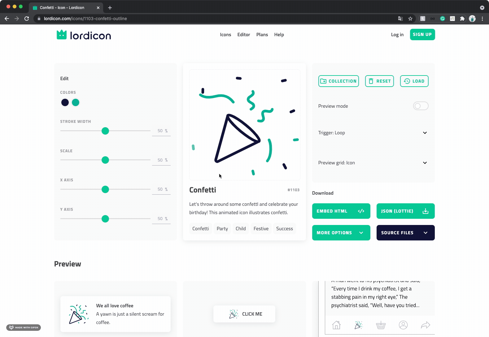
Iordicon: A nice resource for animations.
Structure your components-file and make it readable
Document components that need explanations. Suddenly you are starting on a new project that requires your attention leaving no time to document or clean up unused components. Such documentation could for example be, when is the component used, how many states does that particular component have, how should it look in those states, and what actions should be available in those different states? Many questions can easily be explained in your components file by just adding a short description below the frame.
A delightful feature that should be looked at is the possibility to export the components in a design into code! All properties such as colours, font styles, font size, spacing, and the overall styling properties — automatically being translated into code. That way, the developer could jump-start the development by automating the process of for example creating a theme.ts via a CLI, or even better: a Figma CLI.
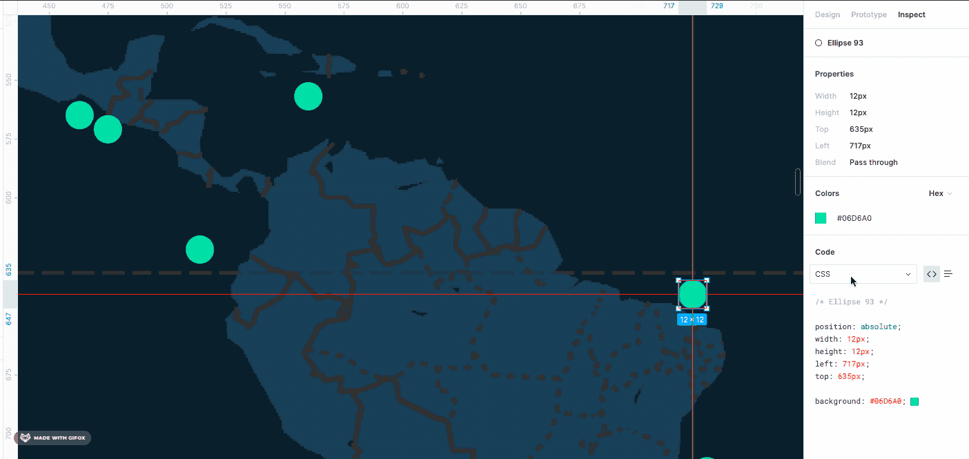
Exporting styles from Figma
Figma has this built-in feature that allows anyone with access to inspect the component. This is a handy feature for both the designer and the developer, as the specificity is provided in Figma and can be inspected by the developer building the frontend.
Prototyping tools deserve a proper version control system
I love Figma and use it daily in our work, but it requires structure and a follow-up with the team if there are changes to a design. Recently Figma added a new feature in their beta version that is aligned with git, a version control system used in development. This allows the designer to track changes in the design and manage several versions of a prototype. However, the designer would need to learn the basics of when to use a branch and when not to. If you’re working on a large project with many components and sketches and pages, it might be wise to check out the new branching feature.
Preparing a user test using the branch feature in Figma would be easier as the branch takes an isolated copy of the current version of the design. This will aid the designer in modifying a component or feature that can be used in a user test, without worrying about affecting the main design. Nice!
Using the branch feature, the process of publishing a new design change would match the same workflow for the developer using the version control system in their daily work. However, the branching feature structures the workflow for designers, but how can the branching feature alert the developers that a new design is added to the master file, and how can the developer know what’s implemented and what has changed? The feature is still in the beta version of Figma, and I can’t wait to see how the branching feature turns out.
Regardless of branching in the design tool, designers have to clearly communicate what has changed in the design. One way to easily highlight this is by marking the different screens with for example green checkmarks for implemented, and yellow question marks for changes. This requires a lot of follow-ups, so be aware of that.
-png.png)
What is implemented, and what has changed in the design?
Ease the transition from development to test
From the tester’s point of view, it is important to look at the systems’ flow in the context of identifying the overall behaviour of the system. The clickable prototype is a good feature to communicate specific transitions or microinteractions both before and after the development. The tester can look at the design and verify that the implemented solution matches the prototype. That way, the transition from development to could cause less rework as the details in designs are well documented by using tools to support a good DX.
Key takeaways
- Test the branch feature in Figma for better version control if makes sense in your project.
- Use tools that support the existing processes within your team and avoid knowledge gaps.
- Try out new tools to support the developer experience and ease the process from design to code.
- Talk with your team and find tools that can support the processes and disciplines in the team.
To summarize
I hope this article made you reflect on why designers should embrace DX, and what benefits it might provide you and your team. The main components of DX is a good guideline to follow and each team have different needs on how to work better together, so use tools, processes to support your needs and to support the team culture and discipline.
This blog post was originally posted on bootcamp.uxdesign.

